Setting the mood with your edits
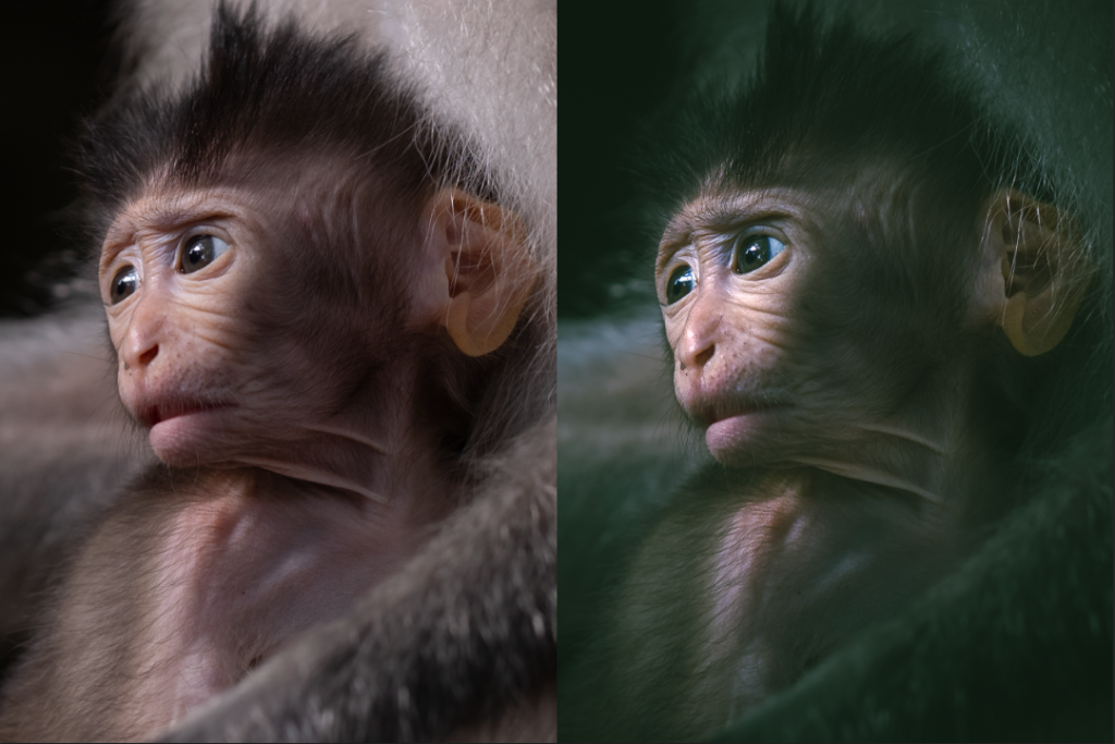
Recently I’ve been experimenting with colour grading a bit. It’s not that I’m bored of my edits or that I’m wanting to reinvent myself but I really believe that an edit should reflect the mood that you’re wanting to achieve in a photo and colour plays a huge role in that. Of course at a really basic level you can play with colour using white balance but this affects every aspect of you image uniformly which prevents you from using the powerful tool of colour contrast. Colour contrast is similar to brightness (luminance) contrast in that you are trying to make sections of your image oppose or harmonise with each other.
Normally we do this with brights vs darks but colour grading allows us to ‘tint’ the shadows, mids and highlights independently using opposing or complementary colours depending on what you’re going for. In addition to using colour contrast to create mood I’ve found myself going to the curves adjustment more and more to raise the black point in the image to a dark dark grey. This is that kind of ‘milky look’ you get in the shadows. It’s a great way to reduce the harshness of a shot (especially landscapes) when done correctly. These Lightroom tools aren’t complex to use but can be tricky to get them ‘right’, so experimentation is key.